Pick Me : Simplifying your Shopping Choices
Pick Me is a web page that help users find nearby stores, compare distances and explore prices for smarter shopping decisions. It simplifies local shopping with ease and convenience.

Feb 2024, 3 weeks
UI/UX Designer
Figma
Challenge
Finding specific items while traveling or even in familiar areas can often be time-consuming and frustrating. For travellers, the challenge lies in locating nearby shops that sell the items they need, while for locals, the difficulty is comparing prices or ensuring an item’s availability before visiting a shop. This lack of accessible and reliable information leads to wasted time, unnecessary effort, and missed opportunities for better deals.
Results
Pick Me addresses these challenges by offering a simple and intuitive platform where users can search for specific items and instantly view nearby shops that stock them. The app provides detailed information, including item availability, prices, shop distances, and reviews. This allows users to make informed decisions, whether they are exploring an unfamiliar area or simply comparing options in their own locality. By streamlining the search and comparison process, "Pick Me" saves time, reduces effort, and enhances the overall shopping experience.
Design Process
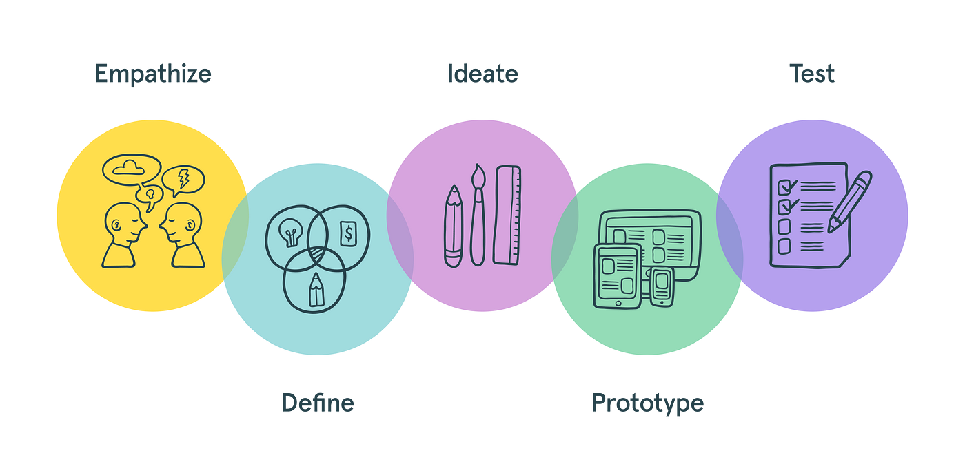
Design Process: Empathise, Define, Ideate, Prototype, Test
Objectives
The objectives of this project are:
User convenience: Make the platform easy to use for all users and help them in locating shops nearby
Improve accessibility: make the website accessible for wide range of users, including new residents and travellers.
Increase User Engagement: add features like rating to increase user trust and enhance user interaction.
Support Local business: this platform can provide visibility to small local shops by updating their inventory and making it available to wider audience.
Target Audience
Travellers: Individuals visiting new cities or countries who need to buy specific items but lack local knowledge.
New Residents: People who have recently moved to a new area and are still getting familiar with the local shops.
General Shoppers: Anyone looking for specific items and wanting to compare prices and distances between shops.
User Research Summary
Research Objective
The primary objective of the user research was to understand the needs, pain points, and behaviours of potential users of the "Pick Me" app, focusing on how they search for and purchase items in unfamiliar locations.
Methodology
Interviews: Conducted in-depth interviews with a selected group of travellers, new residents, and frequent shoppers to gain qualitative insights.
Key Findings
Difficulty in Locating Items:
Travellers and New Residents: Both groups often struggle to find specific items quickly due to unfamiliarity with local shops.
Frequent Shoppers: Even regular shoppers expressed frustration when searching for niche or less common items.
Importance of Price Comparison:
Users prefer comparing prices across different stores to ensure they are getting the best deal.
Many respondents mentioned using multiple apps or websites to check prices, which is a time taking process.
User Pain Points

User Persona
Creating a user persona helped me understand the needs, frustrations, and goals of the target audience, enabling me to design a solution that aligns with their expectations and ensures a more user-centred experience for the "Pick Me" app.


Design System
Psychological Impact
Trust and Reliability: Blue is often associated with trust, reliability, and professionalism. Using blue can help convey that "Pick Me" is a dependable and credible tool for finding nearby shops and products.
Calm and Relaxation: Blue has a calming effect, which can make the app feel less stressful to use, addressing user frustrations with searching for items in unfamiliar locations.
Usability
Readability and Contrast: Shades of blue combined with grey can create a clean, modern look that enhances readability and visual contrast, making the app easy to navigate and use.
Visual Hierarchy: Different shades of blue can help establish a clear visual hierarchy, guiding users’ attention to important elements.
Aesthetic Appeal
Modern and Sleek Design: Blue and grey combined with white together create a sleek and contemporary aesthetic that can appeal to a wide audience, making the app look professional and attractive.

Low fidelity Wireframes
For "Pick Me," designing low-fidelity wireframes allowed me to map out how users would search for items, view shop details, and compare prices without worrying about aesthetics. By keeping it simple, I could test and tweak the core functionality to make sure the user journey felt logical and intuitive.

High fidelity Wireframes
When I moved to high-fidelity wireframes, it was all about showcasing the app’s personality. For "Pick Me," the shades of blue and grey really came together to reflect trust and simplicity. Adding features like the price comparison cards and shop distance indicators in their final form gave me a real sense of how the app would engage users and solve their everyday shopping struggles. It wasn’t just about visuals—it was about creating a seamless, user-friendly experience.
